The Problem
Chronic pain affects 65 million Americans whether due to poor spine health, obesity, or poor coping skills. Those dealing with chronic pain either manage pain via prescription, avoid seeing the doctor or DIY their self-management using friends, family, and the internet. Pain Navigator is a mobile app developed by physicians that provides a customized, holistic program to help those struggling with chronic pain.
The app includes exercise therapy, yoga, health psychology, and pain management education that is proven in reducing pain, pain disability, risk of opioid misuse, and depression.
Business Goal
Identify the largest opportunities for improvement to drive ease of adoption and engagement of PainNavigator’s current web app for an initial patient population.
Project Overview
Industry: Health & Fitness
Duration: 4 weeks
Client: Pain Navigator
Pain Navigator Team
Kelly McKay, CEO
Design Team
Tiffany Lim
Katie Ryan Zeisger
Gaby Zhu
Teresa Taitt (me)
My Role
I contributed to the heuristic analysis, ideation, prototyping, wireframing, synthesis, and final deliverables. I helped our team define and reach our milestones.
Research & Discovery
In May 2021, the company launched a one-week trial of PainNavigator to build their initial user base and establish partnerships with providers that will eventually recommend the full app to their patients. In a short time frame, the app captured over 100 members. Following the trial, 23 users responded to the company’s request for feedback, and a handful of users were selected to participate in customer interviews to provide additional feedback.
The program showed extraordinary results of the interdisciplinary approach on key metrics:
-
52% Reduction in pain within 3 months
-
47% Reduction in risk of opioid misuse
-
40% Reduction in Pain Disability
-
60% Reduction in Depression
Although the program went well, this was not reflected in Pain Navigator's mobile app. User interviews revealed the paints of the app ( i.e. lengthy survey questions, logging into the app, and with logging into the app.
Personas
From the user research, we used affinity mapping to group our findings from the user interviews and synthesize our research. Clustering the post-its together, we found that there were two personas who fit in what they call the “Healthy Unwell” demographic, users with some degree of back pain but are eager to reclaim their life.
To develop the personas, we consulted with PainNavigator who their target user is, and studied the user feedback data. PainNavigator’s target user was someone who fit in what they call the “Healthy Unwell” demographic, users with some degree of back pain but is eager to reclaim their life. An older user with a healthy lifestyle but is experiencing chronic pain due to his old age, a younger user who’s healthy because of their youth, but unwell due to their habits.


Utilizing these insights, we created an empathy map to better understand the user’s pain points, goals, feelings, thoughts, and behaviors.

After gathering our insights via an affinity map and empathy mapping, two personas were formed, Jack and Julia.


Heuristic Analysis
From this point, we evaluated the usability of the mobile app design using the heuristic analysis.
See below for the key usability issues we found while reviewing the application. The full heuristic analysis is here.


Ideation
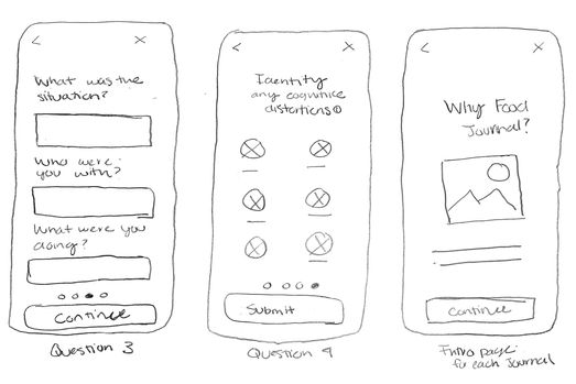
Our team explored ways to simplify the user experience from onboarding to walking through the module. We began with the user flow which we refined to streamline the patient's experience. Then, We sketched out quick wireframes before translating them into low-fidelity wireframes. We explored ways to incorporate an SSO, consolidate the diary section to increase ease of use, and provide direction for the user.
We thought through how to balance obtaining the required information that the client needed to gather data and reducing the questions to improve the user experience.
Onboarding
Home + New User Questions
Modules + SMART Goals
Journals
Wireframing + Prototyping
While finalizing the wireframes, we made the following updates:
-
Onboarding questions to remind the user of the goal of the Pain Navigator app.
-
Provided an SSO/magic link for users to sign-in
-
To avoid user abandonment, we shortened the onboarding process and opted to let the user finish creating their profile within the profile settings.
-
Transcripts for education modules
-
Provided weekly tasks and notifications for users to keep them engaged
-
Provided design options for empty states
One of the key constraints for the design was simplifying the app and giving the brand more personality. We overcame this issue by providing revised design options for different question formats, the context for the users via introduction screens, and personality with the success pages and revised language throughout the app.

Reflections
In the span of four weeks, we developed and redesigned the Pain Navigator for a better user experience. As a team, we held each other accountable for our assigned responsibilities. We balanced working independently and collaboratively on various tasks, supporting each other along the way when needed. It was a pleasure getting to work with the Pain Navigator team as well as our design team. Together, we provided deliverables that excited our client, and they have already started to incorporate our design changes into their app.
For the next phase of the project, we would have provided high-fidelity designs and performed usability tests with their users to see if there were any further findings and iteration on our designs. Overall, this has been a positive experience, and we are anxious to see how our designs impact their users and allow Pain Navigator to meet their KPI goals.


